Rebranding: From Market Stall to Modern Wholesale
Originally founded as The Candy Box in 2001 by Guy Marlow, Spectrum Foodservice has grown from a humble market stall into a dynamic, family-run food and drink wholesaler. With roots in bagged sweets and a legacy of serving schools across the UK, the business has evolved to offer a wide range of products, including school-approved drinks, vending options, grocery, cakes, confectionery, and crisps. Now operating across education, vending, jiffy vans, golf clubs, cafes, and corporate sites, the company stands at the forefront of independent wholesale supply.
After a decade of growth—and a near doubling in turnover over the last three years—the company needed a brand that reflected its current scale, future ambitions, and its reputation for reliability, flexibility, and quality service.
The Goal.
The brief was clear: evolve The Candy Box into a brand that resonates with the company’s wider customer base and future goals. The original logo was a placeholder created in Photoshop, the website felt generic and impersonal, and branding elements lacked cohesion across touchpoints.
The new name—Spectrum Foodservice—needed to reflect the company’s expanded range, flexible offering, and its values as a growing, customer-focused, family-run business. The aim was not only to unify the company’s visual identity, but also to energise its presence in the education sector and beyond, support its growth targets, and future-proof the business.
The Process.
The rebrand involved a complete overhaul of the visual and verbal identity. Working closely with the client, we delivered:
- Name Development: We renamed the company from The Candy Box to Spectrum Foodservice—a name that better reflects the company’s diverse offering and responsive, customer-first approach.
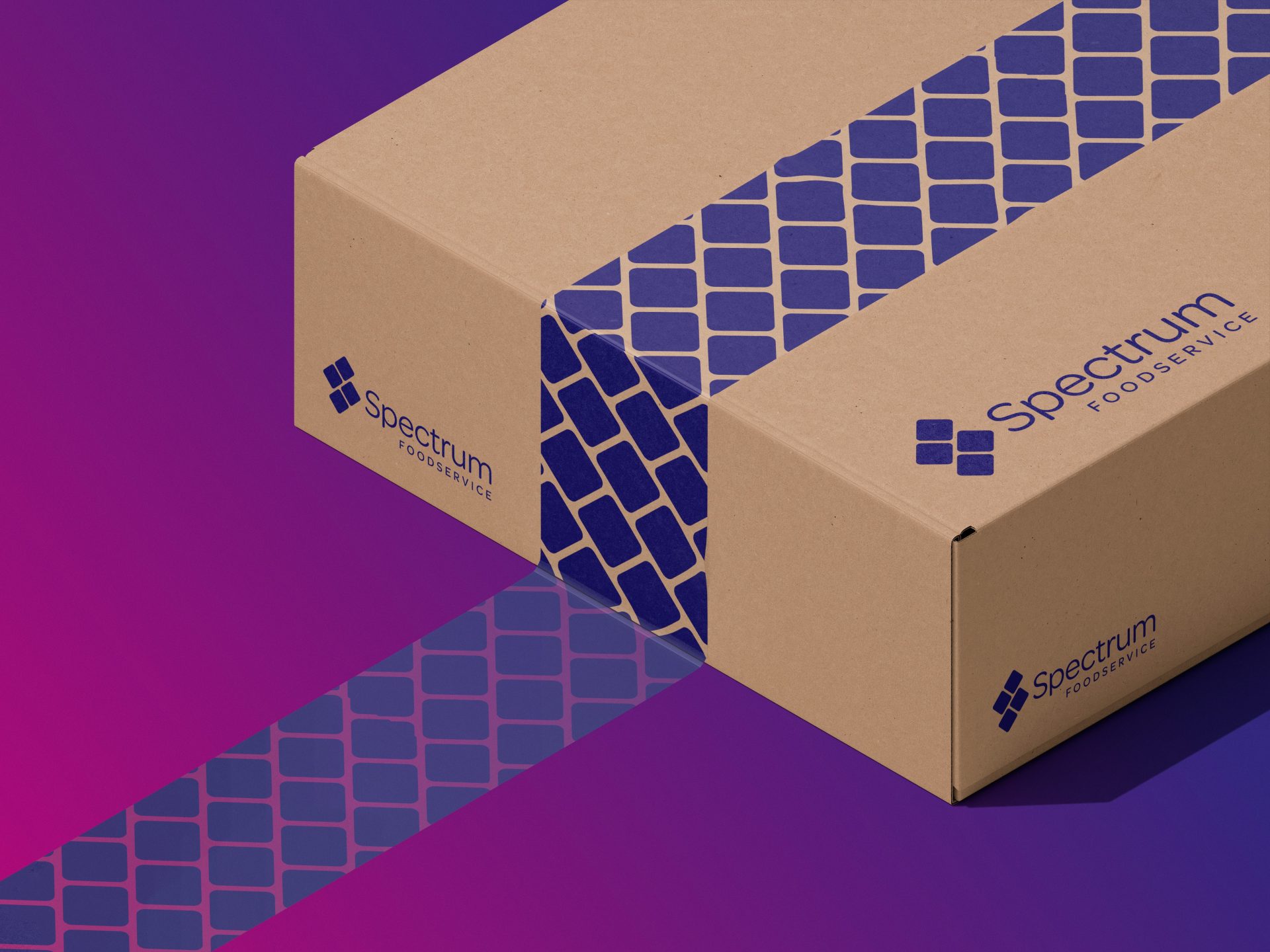
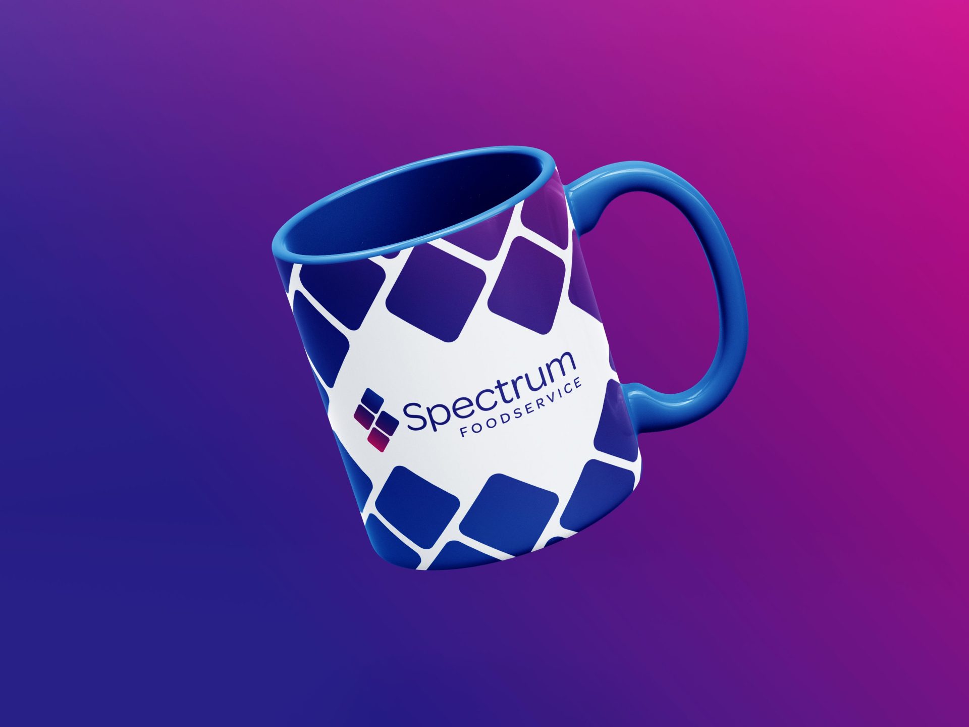
- Logo & Visual Identity: A fresh, clean logo was created—chosen to represent energy, reliability, and approachability—paired with a supporting visual system for consistent branding across platforms.
- Website Refresh: We modernised the website with cleaner visuals, removed stock imagery, improved content structure, and added custom brand language to better reflect the people and personality behind the business.
- Print & Digital Materials: We designed business cards and email signatures creating assets that project professionalism and consistency from first contact.
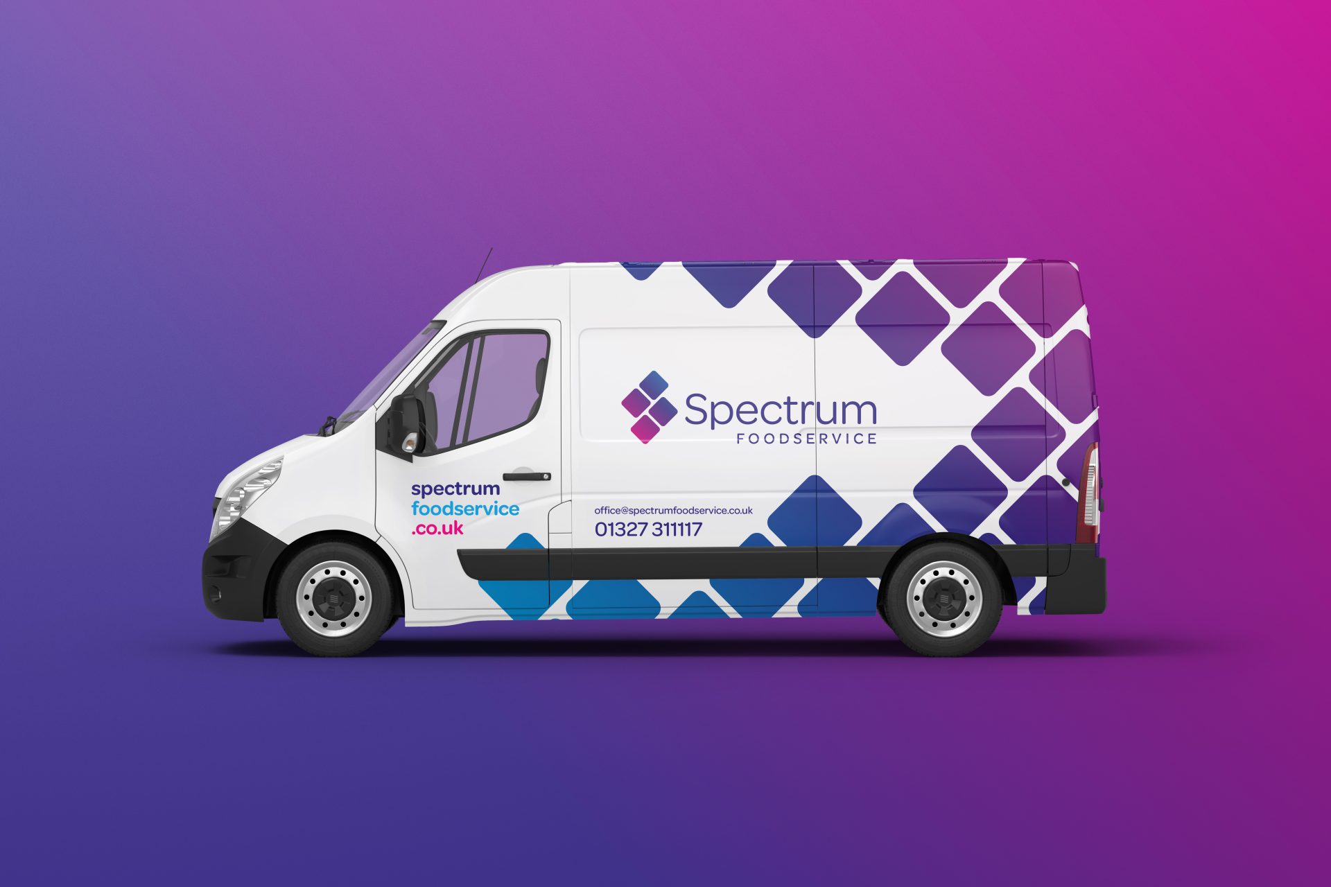
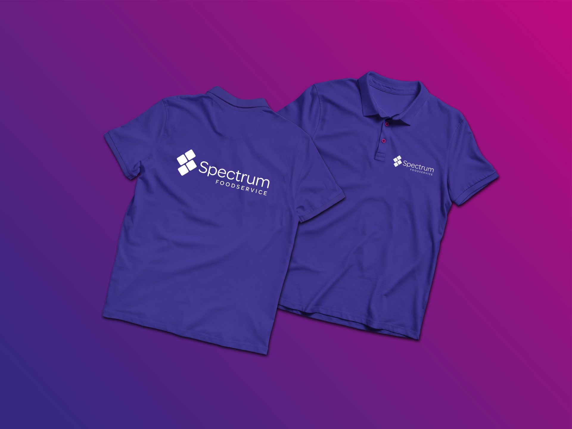
- Uniform & Vehicle Branding: New branded polo shirts and high-vis jackets brought internal visibility and cohesion, while van livery helped the team make a lasting impression on the road and during deliveries.
- Internal Buy-In: Throughout the process, we stayed true to the company’s roots—ensuring the new look was family-driven while opening the door to new markets and bigger opportunities.
The Result.
The rebrand to Spectrum Foodservice has positioned the business for its next phase of growth—with a confident, professional image to match its scale and service.
The rebrand has created a more cohesive, confident, and future-proof presence—both online and offline. Internally, it unified the team under a single, clear identity. Externally, the refreshed logo, materials, and website have helped the business put its best foot forward.
The company now operates with stronger brand recognition, an updated digital presence, and clearer messaging across all customer touchpoints. As Spectrum Foodservice looks to achieve £3.25M turnover this financial year and hit £5M within five years, the rebrand has laid a solid foundation for sustainable, strategic growth.
Let’s get social.
